Case Study · Ubicomp · Assistive Design · Product Design
Lumen Planner
A context-aware smart weekly medicine organizer for older adults — using ambient light cues and sensor-based awareness to support medication adherence without relying on alarms, notifications, or short-term memory.
Overview
Medication adherence is a memory problem. Most solutions make it a technology problem.
Older adults managing daily medications already have a tool they trust: the weekly pill organizer. It's familiar, low-cost, and deeply embedded in routine. The failure isn't the object — it's that nothing tells you whether you've taken today's dose or not, and cognitive fluctuations make that uncertainty dangerous.
Lumen Planner keeps the familiar object and adds a layer of calm, ambient intelligence — LED light cues that respond to interaction, proximity, and time, without notifications, alarms, or complex workflows. It was designed as a Ubiquitous Computing system rooted in Calm Technology principles: present when you need it, invisible when you don't.
Problem Space
Existing solutions either do too little or demand too much.
Missed medication among older adults with mild cognitive impairment is a serious and common health risk. The market has two responses: passive tools (standard pill organizers, paper calendars) that rely entirely on memory, and active tools (apps, automated dispensers like MedaCube) that introduce complexity, cost, and cognitive overhead the target users often can't sustain.
App-based reminders
Require multi-step confirmation workflows. Users have to notice the notification, understand what it's asking, navigate to the app, and confirm. Each step is a point of failure for someone with cognitive fluctuations.
Automated dispensers
Products like MedaCube solve adherence but create new problems: large physical footprints, high costs, and interactions that feel clinical and infantilizing. They remove the user's agency rather than supporting it.
Stakeholders & Context
Designing for dignity, not just usability.
The primary user is an older adult living independently who manages daily medications but experiences mild cognitive challenges — short-term memory lapses, difficulty maintaining routines, variability day to day based on fatigue or distraction. Crucially, they value their independence and do not want a system that draws attention to mistakes or creates a sense of surveillance.
Context matters as much as persona. Medication adherence happens in real environments — kitchens, bedrooms, bathrooms — where memory cues are tied to lighting, movement, and physical routine. The system needed to live in those environments naturally, not add an alien object to a familiar space.
Interaction Design
Four light states. Zero notifications.
The entire interaction model runs on ambient LED cues — no screen, no sound, no vibration. Each state is designed to communicate meaning through color and behavior alone, calibrated so the cues are noticeable without being alarming. The color system was refined after evaluation feedback indicated the initial differentiation between "gentle reminder" and "attention needed" wasn't clear enough.
When a dose is confirmed, Lumen Planner eventually powers down the indicators. On return proximity, it briefly shows the last state — green for taken, amber for missed — so a user who can't remember whether they took their medication can check with a glance rather than a memory effort.
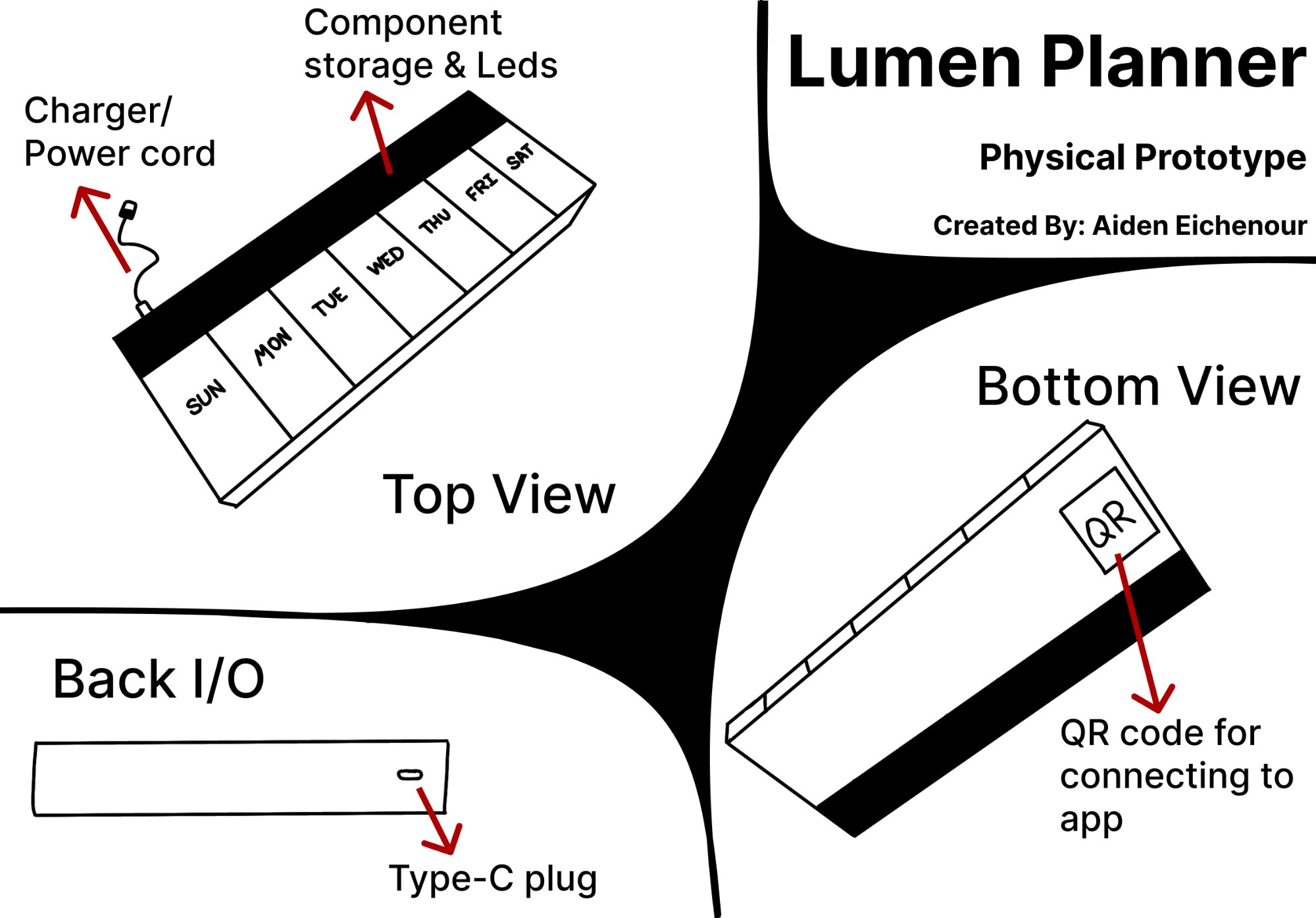
Physical Design
Familiar enough to trust. Smart enough to help.
The physical prototype retains the form factor of a standard weekly pill organizer — clear compartment labels for each day of the week, a form users already know. The back section houses the electronics and a Type-C charging port, with a small internal battery providing approximately one day of autonomous operation during power outages so the system never silently fails.
Familiar form factor
The device looks and feels like a pill organizer users already own. Labeled Sun–Sat compartments, clear lids, compact footprint. The intelligence is additive — not a replacement for the trusted object, an upgrade of it.
QR setup — one scan
Each device has a unique QR code on the underside. First-time setup requires one scan to pair with the companion app — designed specifically so setup couldn't become a barrier for the target user group.
Power resilience
Type-C charging with an internal battery buffer for ~1 day of independent operation. A medication device that silently stops working during a power outage is worse than no device — this constraint was non-negotiable.
Accessible light design
Warm amber chosen for its accessibility across common age-related vision changes. Intensity is customizable via the companion app for users with stronger visual needs. No reliance on red/green distinction alone.
Evaluation & Findings
Two participants. Real scenarios. Actionable findings.
I conducted a small-scale evaluation using a combination of experience walkthrough, scenario-based testing, and heuristic review. Two participants: one aligned closely with the primary persona (mid-70s, memory lapses, living independently), one an adult caregiver who regularly manages a family member's medication routine. Both interacted with the physical mockup, the storyboard, and the Figma prototype across three scenarios.
- Morning Routine Scenario — participants observed the steady amber glow and described what they understood it to mean. Both correctly interpreted it as a reminder, but found the initial brightness level too subtle in a well-lit kitchen.
- Approach & Interaction Scenario — participants simulated walking toward the device and taking a dose. The interaction-detected pulse was well-received: both described feeling like "the device knew what was happening," which matched the design intent.
- Missed Dose Scenario — participants viewed the pulsing escalation sequence. The caregiver found it appropriately urgent; the primary user found the pace comfortable and non-alarming — an important distinction that validated the gradual escalation approach.
What worked
Ambient signals were well-received and felt non-intrusive. The interaction confirmation pulse gave users confidence the system understood them. The physical prototype felt familiar and trustworthy — the form factor decision was validated.
What needed iteration
Clearer differentiation between "gentle glow" and "attention needed" states — addressed through brightness increase and amber gradient pulse. App terminology simplified after both participants found initial labels clinical and unclear.
Iteration
Language is part of the design.
Evaluation feedback flagged that the companion app's status terminology felt clinical and unfamiliar to both participants. Rather than dismissing this as a copy problem, I treated it as an information architecture failure — the labels weren't matching how users actually thought about their medication routine.
| Before | After |
|---|---|
| "Routine Time" | Scheduled Time |
| "Time Since Routine" | Time Elapsed |
| "Pending" | Awaiting Dose |
| "Late" | Taken Late |
Each change reduces cognitive distance between the label and the user's mental model of what's happening. "Awaiting Dose" is something Ellie understands immediately. "Pending" is something she might need to think about — and thinking is exactly the load this system is designed to reduce.
What I Learned
Designing for cognitive load means designing for the hardest moment, not the average one.
The biggest shift this project created in how I think about design is the concept of the "worst case interaction moment." For Ellie, that moment is 7am after a bad night's sleep, in a bright kitchen, wondering if she already took her medication. Every decision in Lumen Planner was stress-tested against that moment — does this still work when attention is low, fatigue is high, and cognitive resources are depleted?
It also deepened my understanding of Ubicomp as a design discipline distinct from conventional UX. Ubicomp isn't about screens that are embedded in objects — it's about computing that disappears into context. The goal isn't an interface users interact with. It's an environment that responds to them.