Case Study · Mobile App · Student Productivity
Mindful
A team project to help college students stop procrastinating and actually follow through — designed through two months of research, rapid prototyping, and iterative usability testing.
Overview
Students have calendars. They just don't follow them.
Despite using calendar apps and to-do lists, students frequently procrastinate, get distracted by their phones, or constantly reshuffle their schedules without moments of reflection. My team set out to fix that.
Over two months, we went from research to a tested high-fidelity prototype — applying every stage of the design process with a focus on innovation and behavioral change. Our final solution helped students complete tasks 21% faster with 13% fewer clicks, while maintaining a 100% task success rate.
Context & Team
A two-month sprint with a team of five.
I worked within a team of five where each member contributed across research, design, and development. My primary responsibilities included user research, wireframing, and usability testing. We structured our workflow into weekly sprints with clearly assigned deliverables — leveraging Figma, FigJam, and Excel to coordinate throughout the project.
One of our biggest challenges was balancing innovation with feasibility. We addressed this through rapid prototyping and iterative feedback loops, ensuring our solution could realistically integrate into students' existing habits rather than replacing them entirely.
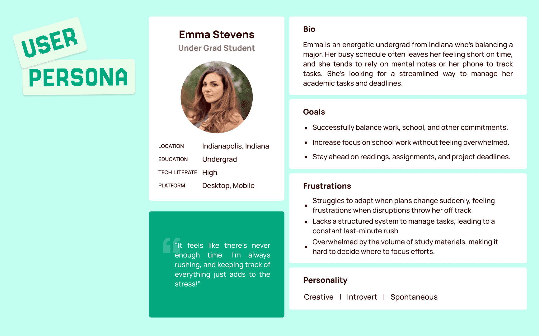
Target Users
We initially scoped broadly, then narrowed to graduate students due to their heavier self-directed workload. We also included a small undergraduate sample to surface commonalities and differences.
My Role
Conducted and facilitated interviews, led affinity mapping sessions, created wireframes, and ran usability test sessions — both as note-taker and moderator.
Project scope and target user framing
Problem Statement
Scheduling tools help students plan. They don't help them follow through.
Our research showed that students frequently push tasks back, get distracted by their phones, or shift their schedules reactively — often without reflecting on their time management habits. Existing productivity tools handle scheduling, but fail to address the behavioral aspects of following through.
This results in stress, decreased efficiency, and missed deadlines. Our project aimed to bridge that gap by designing an intervention that promotes accountability and habit formation.
Our Primary Goals
- Help students stay accountable for their scheduled tasks
- Encourage moments of reflection to reduce reactive, last-minute rescheduling
- Minimize digital distractions during dedicated focus time
- Provide customizable limitations that match individual user preferences
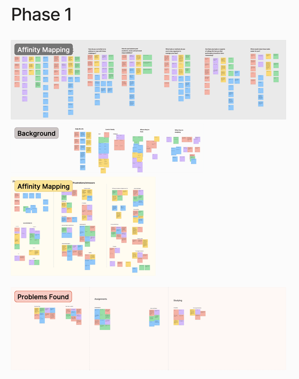
Research & Insights
Two rounds of interviews. One clear pattern.
We used qualitative interviews in two rounds to refine our problem definition. The first round helped us understand general scheduling challenges. The second round, guided by first-round insights, helped us pinpoint the specific behavioral breakdown — students knowing what to do but not doing it.
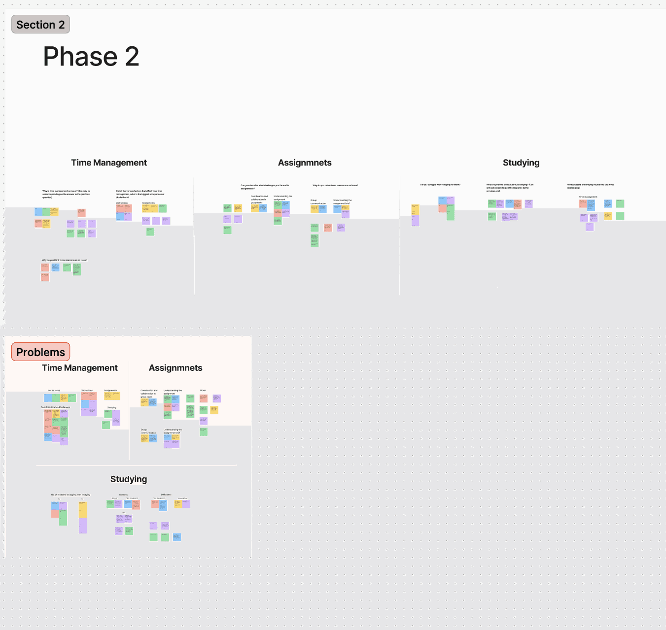
Using affinity mapping in FigJam, we categorized responses into key themes:
These themes shaped our design approach, with a strong focus on motivation and accountability mechanisms rather than adding another scheduling layer on top of existing tools.
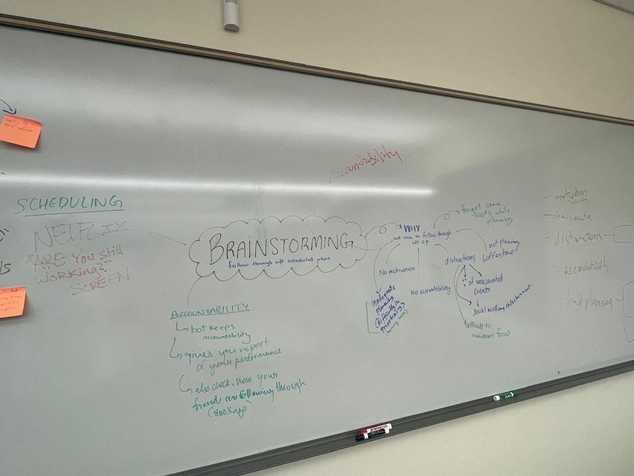
Affinity mapping session — categorizing interview data into behavioral themes
Research Methodology
Structured from the start — not reverse-engineered from results.
We recruited ten students for the discovery phase — a mix of graduate and undergraduate participants selected to surface both the self-directed workload pressures of grad school and the distraction patterns more common among undergrads. Interviews were semi-structured, lasting 25–40 minutes each, and focused on three areas: existing scheduling habits, moments of failure or procrastination, and emotional responses to those failures.
25 Discovery interviews
Semi-structured sessions, 25–40 min each. I served as both moderator and note-taker across different sessions, learning to stay neutral and resist the impulse to help participants who were struggling with tasks or questions.
Affinity mapping in FigJam
Raw notes from all ten interviews were synthesized into five behavioral themes. The full team participated in the mapping session to reduce individual bias and ensure multiple interpretations of ambiguous data points were considered.
15 participants at mid-fi
Structured usability tests with timed tasks, click counting, and a satisfaction survey. Three critical usability issues were identified and resolved — all related to navigation labeling, save state clarity, and onboarding copy — before moving to high-fidelity.
20 participants at hi-fi
Final validation round using the same task set and KPI framework. Results showed 21% faster completion, 13% fewer clicks, and 100% task success rate — confirming the mid-fi fixes held and the high-fidelity layer added clarity rather than complexity.
Design Process & Iterations
Low-fi to high-fi, tested at every step.
In the prototyping phase we explored two low-fidelity concepts, each addressing different aspects of the problem. Through observational testing with participants, we tracked key KPIs: average time on task, number of clicks, success rate, and user satisfaction.
Based on those results, we narrowed to two mid-fidelity prototypes and refined interactions from user feedback. We ultimately selected Mindful as the primary design — it showed greater personality and more realistic feasibility for real-world use.
- Low-fidelity testing — two competing concepts tested with participants to surface which core interaction model resonated most.
- Mid-fidelity iteration — refined two variants based on testing data; Mindful outperformed on user satisfaction and clarity.
- High-fidelity build — calming color palette, refined typography, and subtle animations added to guide interactions and reduce cognitive load.
- Gamification pivot — initially explored gamified habit tracking; users found it overwhelming during testing, so we shifted to a subtle accountability system with no pressure mechanics.
Early wireframes and mid-fidelity screens from the prototyping phase
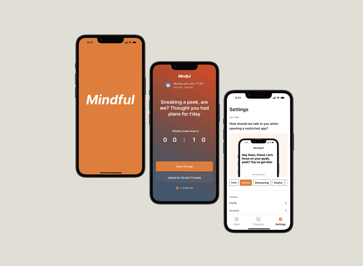
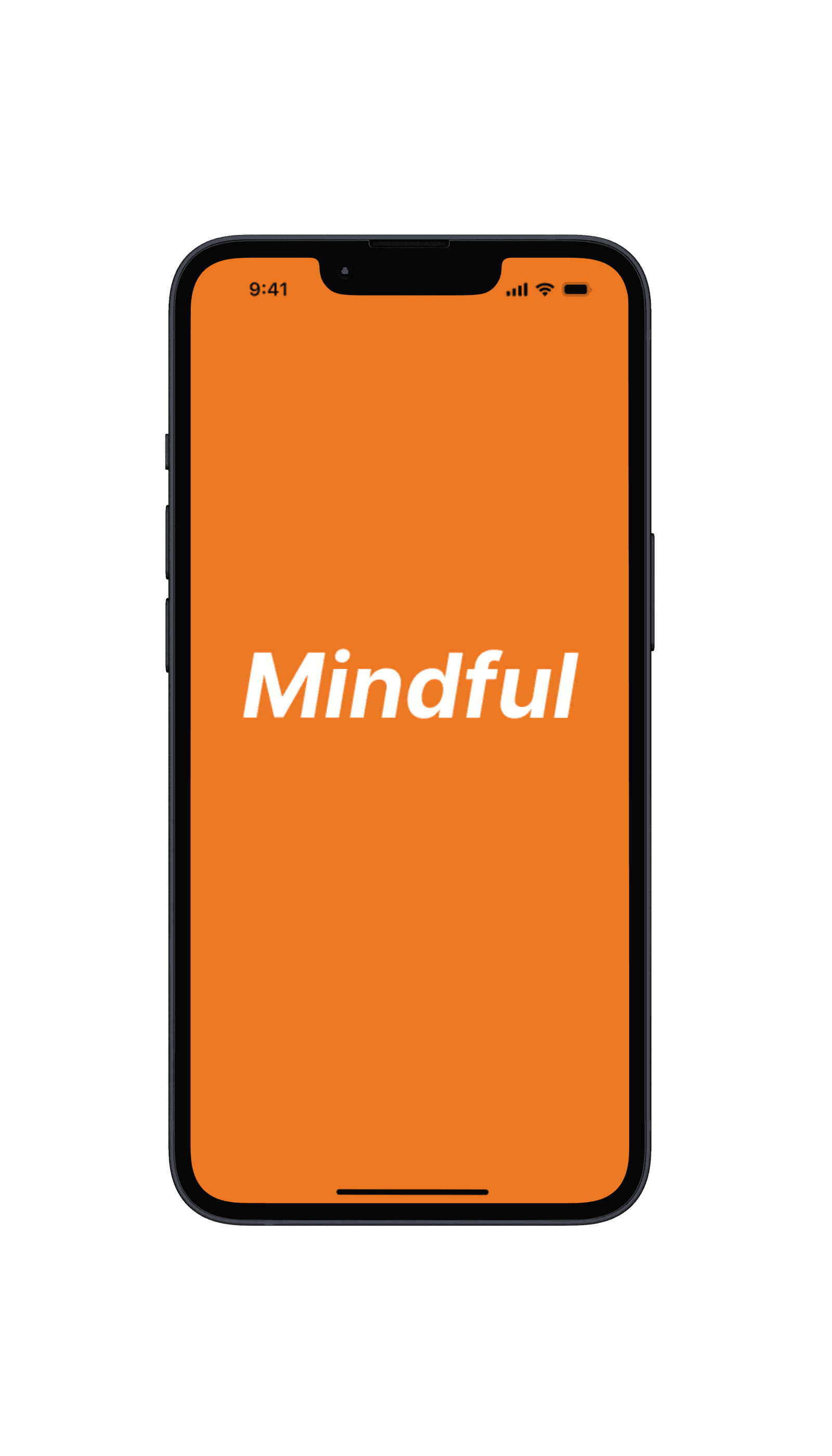
Final Solution
A reflection app that makes follow-through feel natural.
For the high-fidelity prototype, we focused on visual polish and accessibility. A calming color palette promotes focus, adjusted typography improves readability, and subtle animations guide user interactions without being distracting.
Rather than adding pressure with streaks or gamification, Mindful creates gentle moments of accountability — prompting students to reflect on their schedule, not just view it.
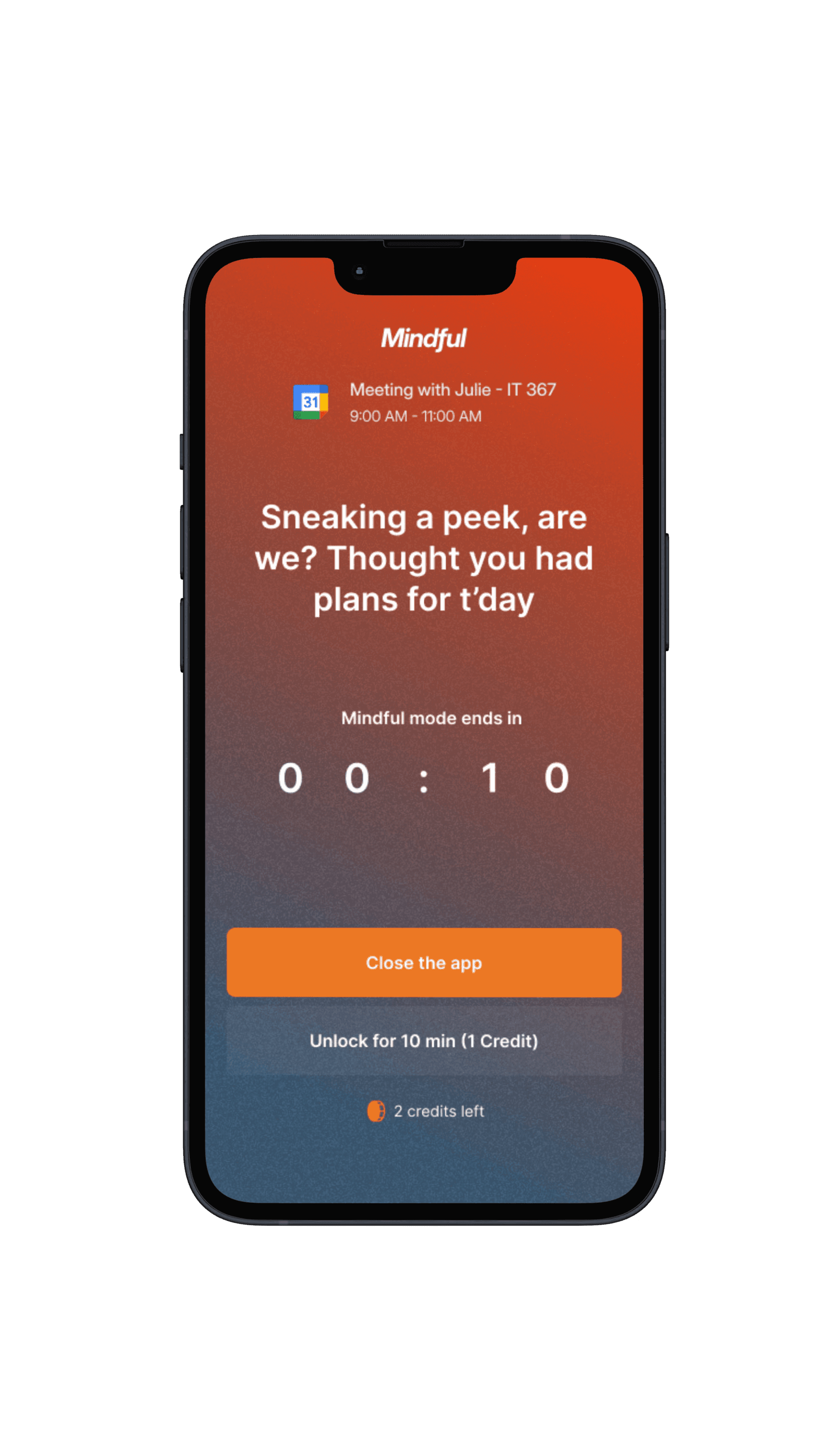
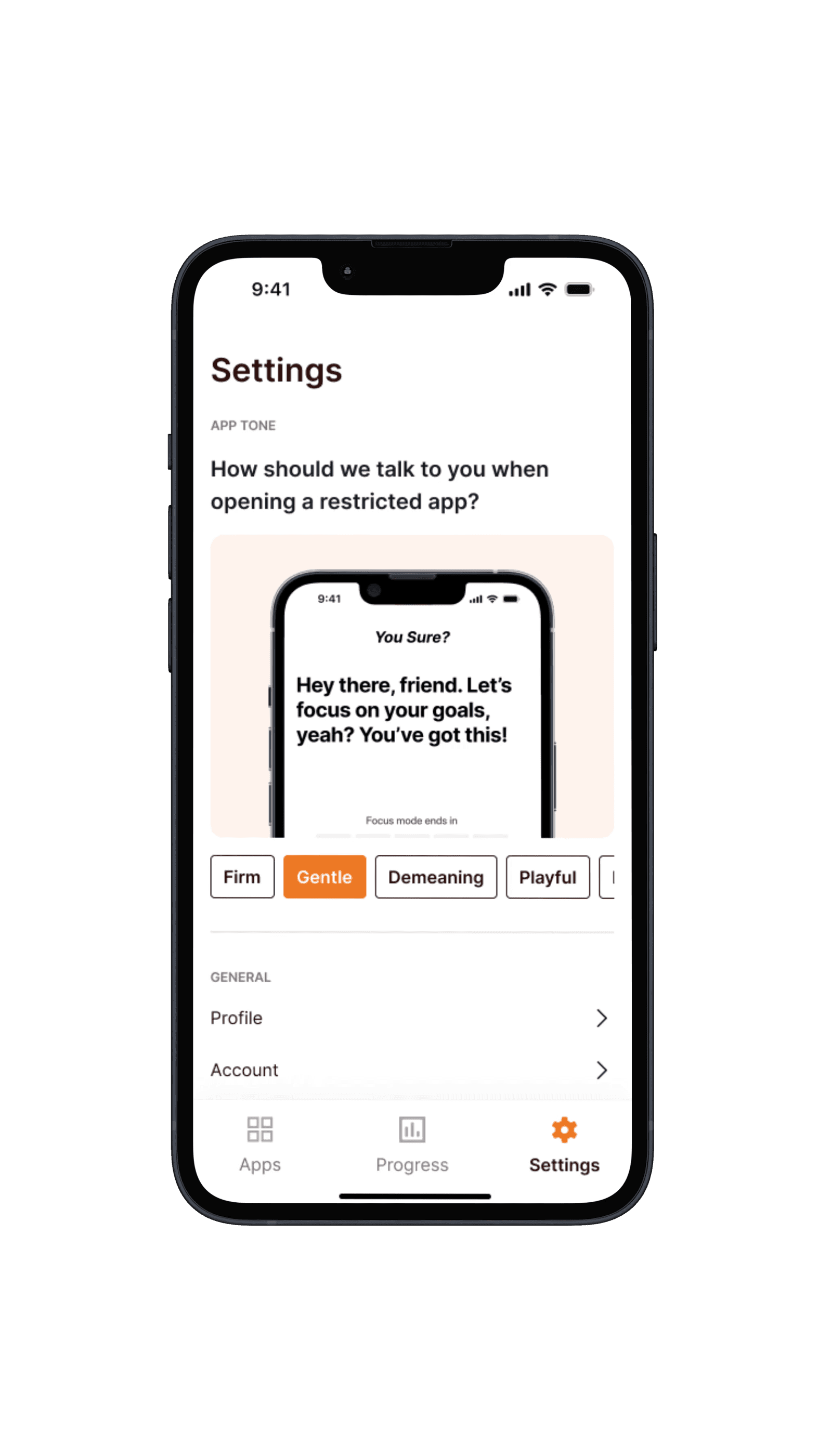
High-fidelity screens from the final Mindful prototype
Testing Outcomes
Numbers that validated the design direction.
Across two rounds of structured usability testing — 15 participants at mid-fidelity and 20 participants at high-fidelity — we measured four KPIs: average time on task, click count, task success rate, and user satisfaction. Tasks included scheduling a study session, reviewing a past reflection, and editing a task mid-session — each timed from first interaction to successful completion by a neutral moderator.
3 critical issues resolved
Mid-fi testing surfaced three recurring blockers — an ambiguous navigation label, an unclear save state, and a reflection prompt that confused new users. All three were resolved before high-fidelity build.
A/B tested two layouts
We ran A/B testing on two landing page layouts, gathering behavioral data on which structure led users more naturally to the core scheduling flow. The winning layout improved conversion into the core task by 10%.
Reflections & Learnings
What two months of research and design taught me.
This project sharpened my ability to efficiently identify the real problem to solve — not just the surface-level complaint — and to understand user concerns and pain points without projecting assumptions onto them.
I also developed my skills as both a note-taker and a moderator during research sessions. Learning to stay neutral, resist the urge to help participants, and let them struggle productively was crucial — any assistance would have corrupted our time-on-task and completion rate data.